ShopDreamUp AI ArtDreamUp
Deviation Actions


Suggested Deviants


Suggested Collections


Description
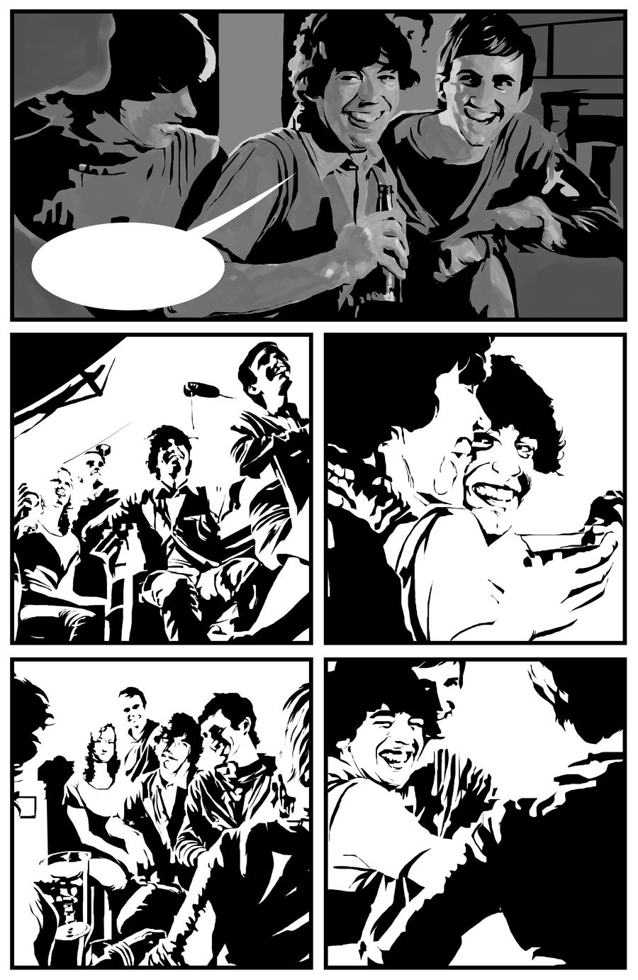
Further playing on this 
Painted greys in to add solidity to the first panel as a test. I'm not sure if it's better or worse, so will have it sitting around for a bit while I think about it. As usual, comments are very welcome!
It took a good hour to block in the tone of just one panel, so I'm not sure how practical it'll be.
Pencil / Illustrator / Photoshop
Image size
2607x4003px 1.8 MB
Comments7
Join the community to add your comment. Already a deviant? Log In
Honestly, I liked it better in b/w. Seems to me that the greys just kill the original mood without adding any real solidity in here. However, that could also be because the greys you used are slightly too similar between themselves, never too dark nor too light. I had the same problem on some pages of my project about Charlie Parker. The pages that most people liked were those where we majorly contrasted the greys as well. Those with all the "middle of the road" greys had little success.
However, if you play with massive black-white interplays, lose the greys. They serve no purpose, but to take away the importance from the black and white areas. The trick is to make it solid and clear with black and white alone, something Alberto Breccia did marvelously in "Mort Cinder" and "Eternauta". Having said that, I'd absolutely use some outlines.
PS - if this comment sounds anywhere near cocky, do know that I'm having the very same problems ^^